Money transfer
2019
My role
— UX lead
— Research
— Visual Design
— Motion design
— Usability Testing
Company
Western Union is a global leader in cross-border, cross-currency Money Transfer Services. Through its digital channels, Western Union helps people and businesses move money to more than 500,000 agent locations in over 200 countries and territories, and in more than 130 currencies.
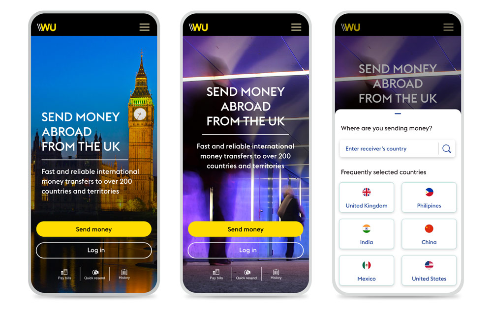
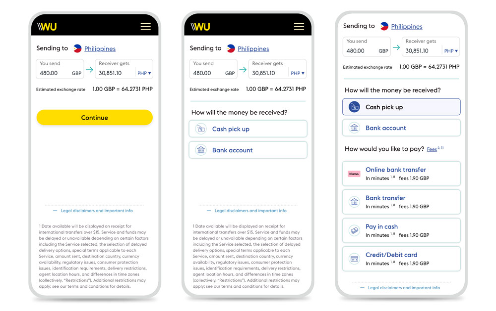
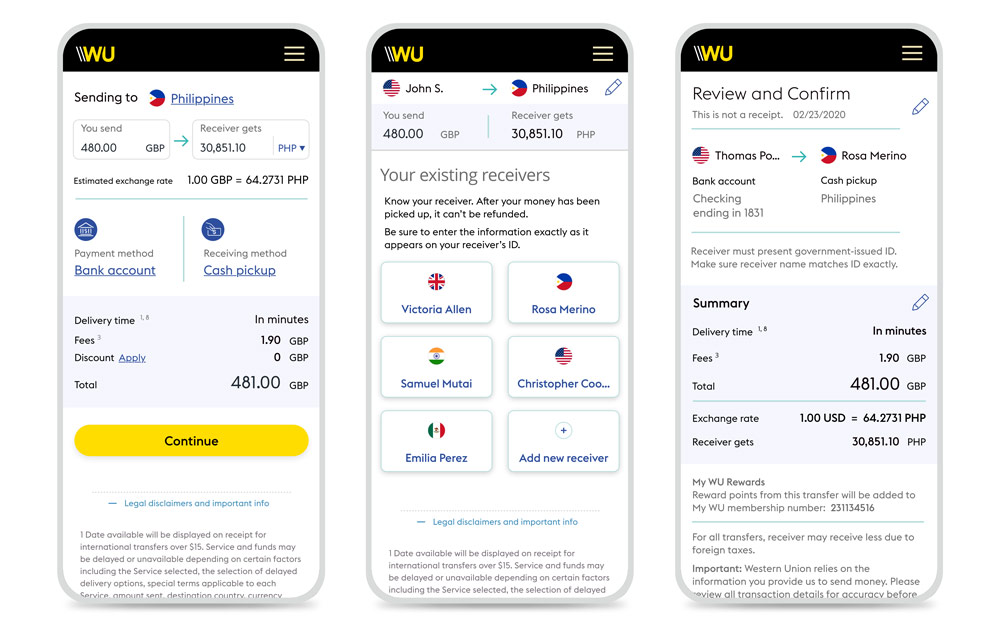
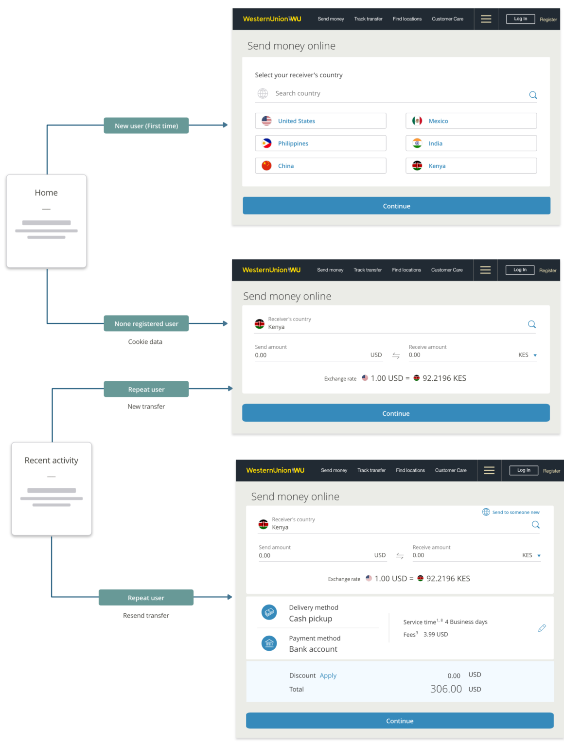
The Money Transfer flow is the most important flow of our digital product. It sets the journey for all our digital customers. Users can select which country they want to send money to. And, the platform offers several different delivery options and payment methods.
The purpose was to minimize cognitive load for new users and have a progressive experience where they can focus on small tasks.
Project background
Project background
The Money Transfer flow is the most important flow of our digital product. It sets the journey for all our digital customers. Users can select which country they want to send money to. And, the platform offers several different delivery options and payment methods.
The purpose was to minimize cognitive load for new users and have a progressive experience where they can focus on small tasks.
Journey map

Goals & Challenges
– Customize the experience for new users versus returning users.
– Reduce cognitive load.
– Increase conversion rates.
– Design to scale for any device or screen resolution.
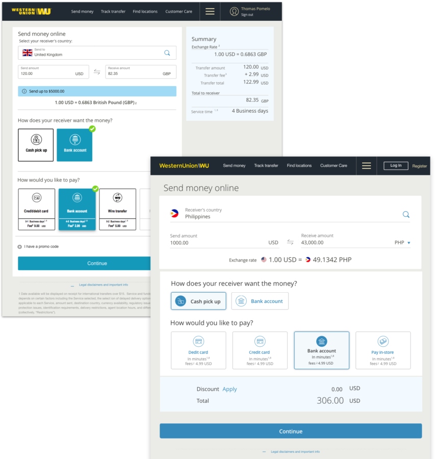
Old page vs First UI update
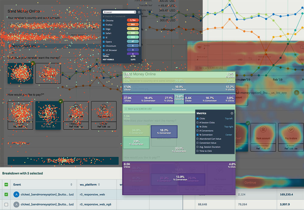
Analyzing quantitative data
The strategy
The first step of this work was to dive into the analytics and user research available at Western Union to quickly validate assumptions. With the help of the analytical and project management teams, we identified meaningful patterns. We realized that more than 10% of new customers were confused about where to select the receiver country on the first page.
Based on the initial analysis, I was able to improve the layout and design incremental changes for validation with qualitative research and usability testing.
Prototype #2
Customize the experience for new users versus returning users
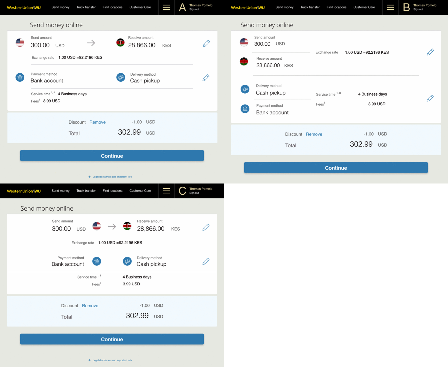
Page layout Impression test (A,B,C)
25 users
— 15 users preferred design A.
— 7 users preferred design B.
Testing helped qualify or disqualify specific design elements, which would then influence the entire team’s strategic decisions as we moved to the full-page redesign.
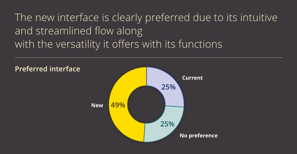
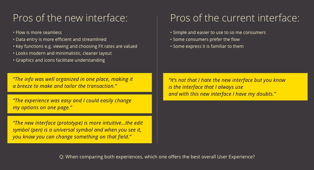
Usability test #3 (report)
Mobile views
