Recent activity
Wireframes
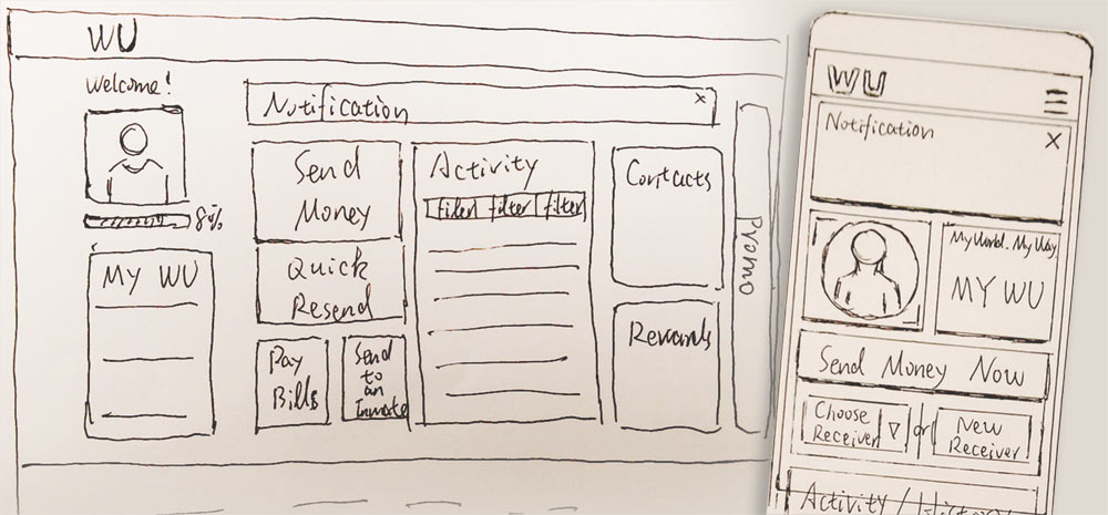
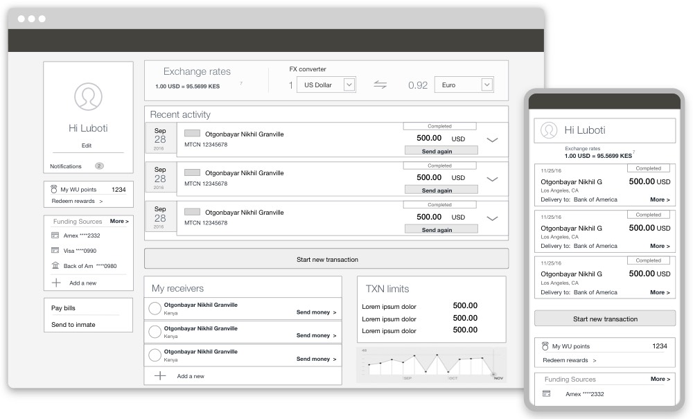
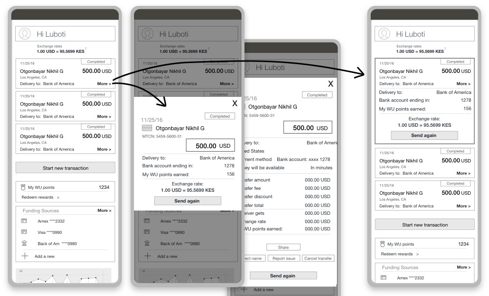
Popup vs collapsible section
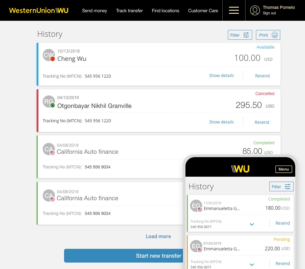
Visual Design
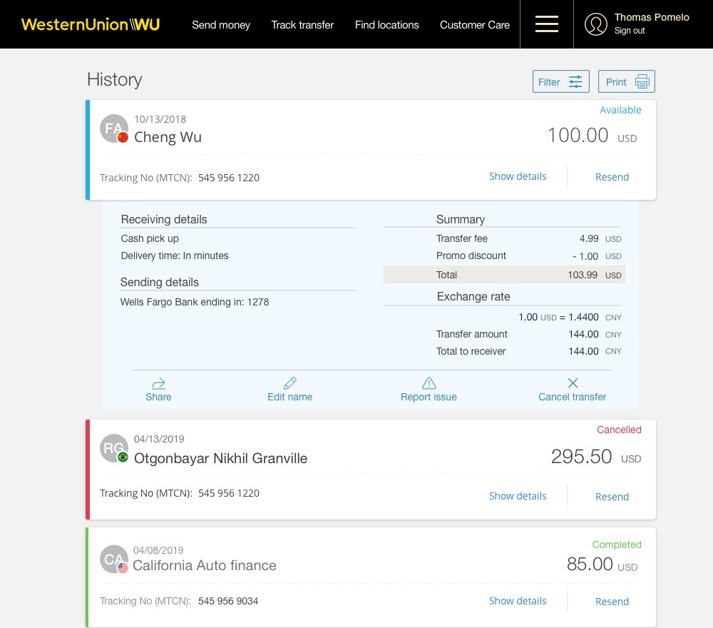
Collapsible section
Mobile view
Style guide
Filters
Animation
Company
Western Union is a global leader in cross-border, cross-currency Money Transfer Services. Through its digital channels, Western Union helps people and businesses move money to more than 500,000 agent locations in over 200 countries and territories, and in more than 130 currencies.
Project background
We needed to provide an at-a-glance view of the most relevant information for our customers like past transactions, payment methods, exchange rates, currency fluctuations, notifications, rewards, etc. As with any dashboard design, the biggest challenge was to balance too much versus not enough information in a small space while keeping it still easy to read for the viewer.
My role
UX lead
Brainstorming
User Flows
Visual Design
Goals & Challenges
The initial scope of the project was to build a dashboard, but due to technical constraints and time, it was downgraded to display only past transactions. This didn’t stop us from thinking about the possible evolution and scalability of the product.
Our high-level goals changed to:
– Present a summary of previews transactions
– Increase conversion by creating a fast and easy way to repeat a transaction.
The strategy
We collaborated with other teams to analyze available data. Then, I conducted the competitive analysis and studied other options across different industries to identify patterns and catalog their most useful offerings.
Key findings from our customer research were:
– Most of our customers wanted an easy way to find their transfer status.
– The most active users sent money once a month, and they repeat the same transaction.
– Most of them sent to an average of 4 receivers.
– Through our research, we found out that the four most important data points were:
- Sent amount,
- Receiver’s name,
- Transfer status,
- Resend link.
The Resend link was our focal point as it was critical to increase conversion.
Solution
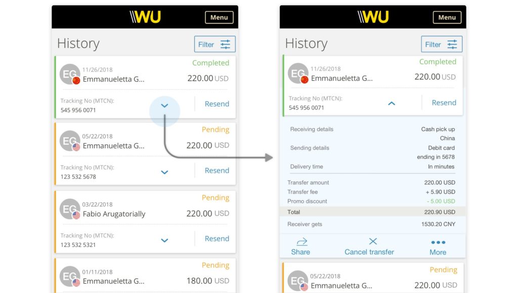
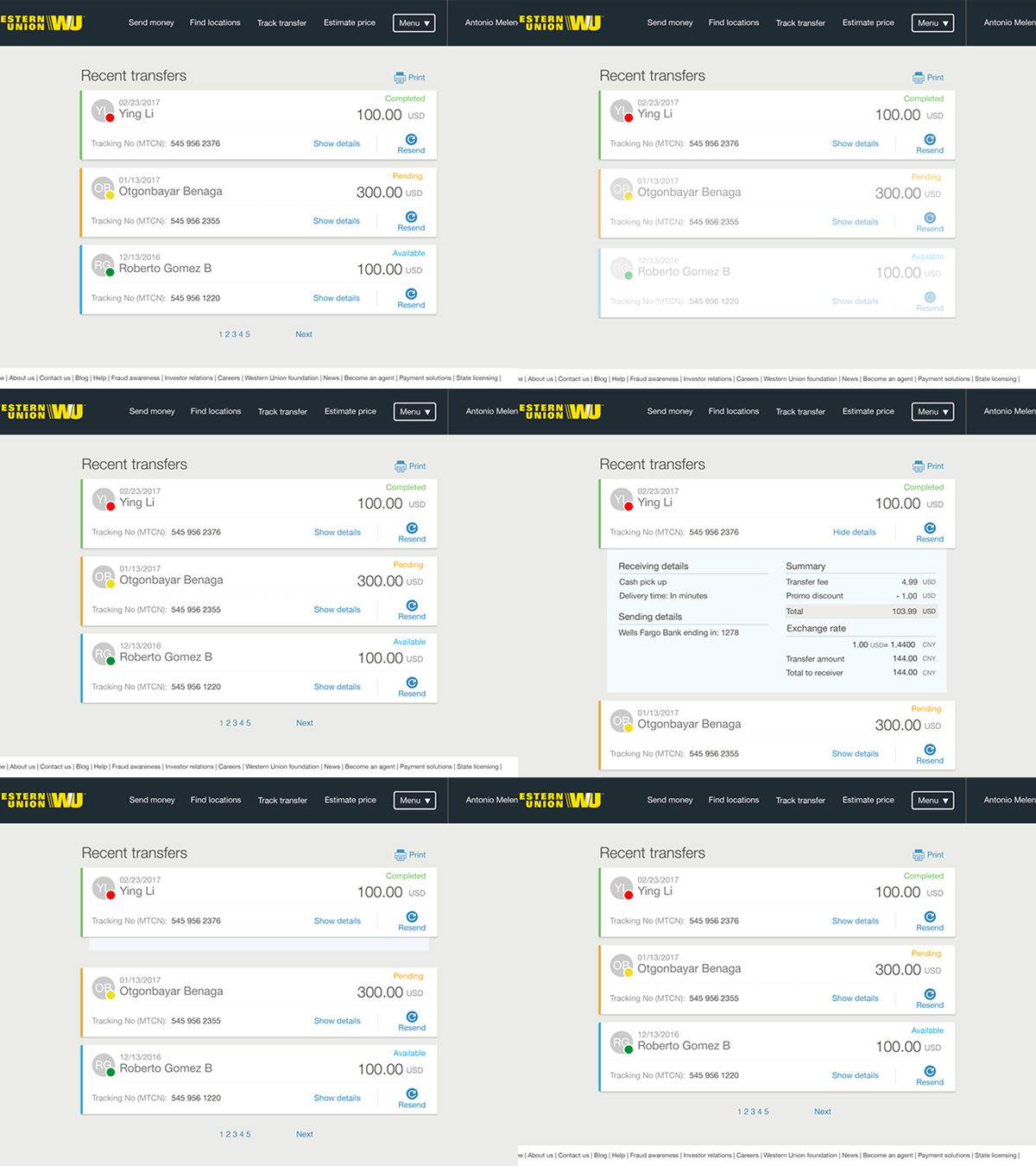
The visual design mimics a front card that holds an expandable panel moving up and down to show or hide the fine details. The card has an accordion functionality that animates the panel smoothly.
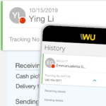
Every user can see the most significant and high-level insights about each of the past transactions upfront: Sent amount, Receiver’s name, Transfer status and Resend link. This view allows users to quickly identify the status of all their transactions simultaneously.
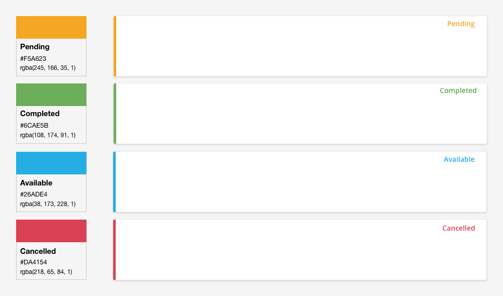
The color-coded label and color bar on the left side of the card were a key to highlight the transfer status. Identify transfer status is very important to many customers who want to see the progress of their transactions especially when they have not been picked up by their receivers.
The expanded view is for the few customers who would prefer to drill down further and see the delivery time, fees, payment details, and even some actions like edit, cancel or share transactions.
